Well, my navigation menu you see on the top of the right widget bar is starting to get messier and uglier that I have decided to do a brand new one from scratch. Actually, it got ugly and bulkier from the last update. Not only in appearance, but also the code involved. They are originally supposed to all look the same, with only the title and type of blog changed.
(extracted from an earlier post)
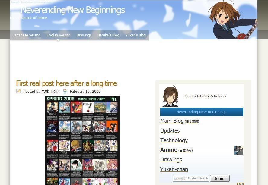
The navigation menu featured here is what it looked like when I first made it. Clean and simple. That empty space there was intentional, but I added random quotes or "Haruka Takahashi's Network". For ones that had the former, it was latter replaced with my latest post from Twitter. Also, hovering over a link there would have a background, but as I found out later on, this also affected other links on the blog. That problem wasn't really fixed until just last month.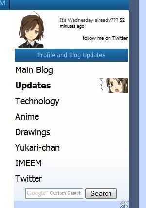
(From Updates and Anime blog (English version) blogs.)
Shortly after doing v0030a, I replaced the image and have it aligned to the left. I have also made the links larger and if you hover the row where a particular link is, an image would appear. These are 60*60 images that are (at that time) also used for displaying my drawings on my non-main blogs, which itself, has now changed to 80*80 versions. In the case of the links to the Main and Technology blogs, new ones were used. If the blog does not already have a search box, I would add it as part of the menu.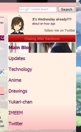
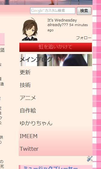
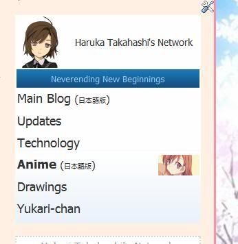
(Japanese & English versions of my main blogs. Search box is not part of the navigation menu.)
The pink/red colours were originally part of an experiment to try different colours of the navigation menu, but didn't really work out well, especially with the strong red for the title. Since both blogs uses mostly pink/red and matches more than the blue version, I have left it untouched.
Also, I found the images to be quite small and decided to have it occupy the entire row. At first, it was to have the image to gradually fade from transparent to opaque from left to right and have it aligned on the far right, but it looked horrible and editing the images to get it was too troublesome. So I gave up and have it to occupy it completely. Since the blog layout that has this menu the widest is the drawings blog (back then) at 280px, I used that as reference for the maximum width.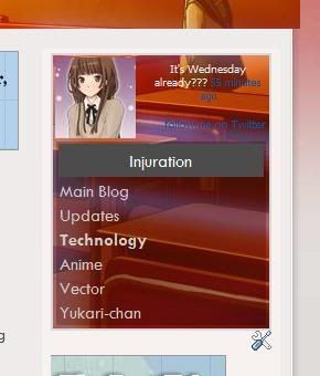
(Technology, Drawings, and Anime (Japanese) blogs)
Not too long ago, Yukari changed her navigation menu and me changing my Twitter page (on the same day as I found images of both the avatar and background). Though simple, it actually looked nice. So in order to improve mine, I have to dump all the image codes except the avatar. The avatar is the exact same image used at Twitter, so the area for my avatar has been reduced from 80*80 to 72*72. Originally, they are supposed to have just a white background, but I use the same background as the blog background or any other image that are already used on the blog. This not only makes it looks nicer, but also save bandwidth from loading the images. Since having an image to appear when hovering over a link is removed, even more bandwidth is saved. That black semi-transparent background is actually recycled from the old drawings blog and helps reading against the textured image easier.
Except for the Anime blog in English, I'm not sure if I want to apply the new version to blogs that are still using the older version for legacy reasons or would actually match the blog layout the most. Currently, the diagonal length of the menu on the Japanese main blog is 5 inches, but the drawings blog is 3 inches. That is quite a lot. I might also replace the avatar of the new navigation menu with an identical-looking v0080 when I'm done with it.
skip to main |
skip to sidebar
List of updates to my profile and blogs.


